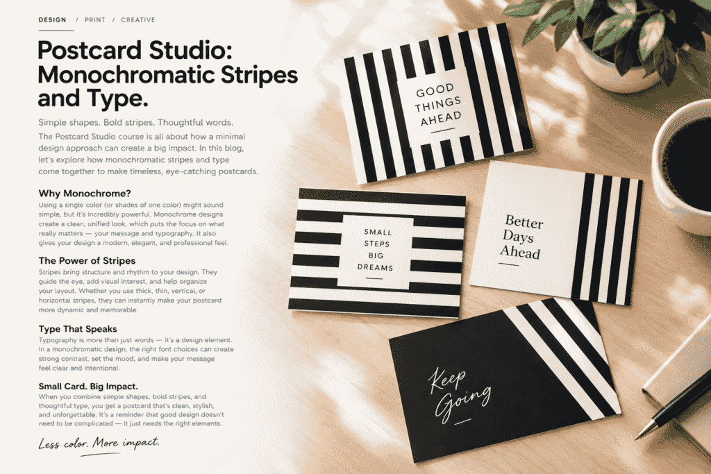
Postcard Studio: Monochromatic Stripes and Type
Good design doesn’t always need a lot of color, complicated illustrations, or dozens of visual elements. Sometimes, a simple combination of bold stripes, clean typography, and thoughtful spacing can create something much more memorable.
That is the idea behind Postcard Studio: Monochromatic Stripes and Type—a creative approach to postcard design where less can genuinely feel like more.
In this blog, we’ll explore how monochromatic colors, stripes, and typography can work together to create postcards that feel modern, stylish, and full of personality.
Why Choose a Monochromatic Style?
Monochromatic design means working primarily with one color or a limited range of shades. Black and white are a classic example, and they can be surprisingly powerful when used correctly.
With fewer colors competing for attention, the message becomes the star of the design. Typography, spacing, shapes, and composition become much more important.
A monochromatic postcard can feel:
- Clean and sophisticated
- Modern and professional
- Minimal without being boring
- Easy to recognize
- Visually consistent
The simplicity also gives you more freedom to experiment with layout and typography.
The Power of Stripes
Stripes may seem like a basic design element, but they can completely change the personality of a postcard.
Vertical stripes can make a design feel structured and energetic, while horizontal stripes can create a calmer and more balanced composition. Thick stripes can make a bold statement, whereas thinner lines can add subtle texture.
You can also combine different stripe directions or use them as a frame around your main message.
The key is not to use stripes simply because they look interesting. They should have a purpose within the composition.
For example, stripes can:
- Create visual rhythm
- Guide the viewer’s eye
- Separate different areas
- Frame important text
- Add contrast
- Give a simple layout more character
Typography Is More Than Just Text
One of the most interesting parts of this design style is typography.
When your color palette is limited, the typeface, size, weight, alignment, and spacing have a much bigger role to play. A strong headline can become the main visual element of the entire postcard.
Imagine a simple postcard with a black-and-white striped background and the words:
GOOD THINGS AHEAD
That’s it.
No large illustration is necessary. The typography and composition can carry the entire design.
Choosing the right font is therefore an important part of the creative process. A bold sans-serif typeface can create a contemporary feeling, while an elegant serif or handwritten style can make the same message feel completely different.
Creating Balance With Negative Space
Minimal design isn’t about filling every empty area.
In fact, negative space is one of the most useful tools in a minimalist composition.
Leaving enough space around your headline allows the viewer to focus on the message. It also prevents stripes and decorative elements from overwhelming the design.
A useful approach is to ask yourself:
“Does this element actually need to be here?”
If the answer is no, removing it may make the design stronger.
Small Card, Big Message
A postcard has limited space, which makes it an interesting design challenge.
You have to communicate an idea without overcrowding the layout. This forces you to think carefully about what deserves attention.
Short phrases work particularly well for this style:
- Keep Going
- Better Days Ahead
- Small Steps, Big Dreams
- Good Things Ahead
- Make It Happen
- Stay Curious
The message doesn’t need to explain everything. Sometimes a few carefully chosen words are enough to create an emotional connection.
Experiment With Composition
Once you’ve established your monochromatic palette, don’t be afraid to experiment.
Try placing stripes along the edges of the postcard instead of covering the entire background. Move the headline off-center. Create a large block of black space and place a small piece of white typography inside it.
You can also experiment with:
Vertical stripes + centered typography
Horizontal stripes + oversized headline
Diagonal stripes + minimal text
Solid background + striped border
Small changes in composition can completely transform the final result.
The Beauty of Simplicity
One of the biggest lessons from this design approach is that professional-looking work doesn’t necessarily require complicated techniques.
A limited color palette, a strong typeface, thoughtful spacing, and a clear visual hierarchy can be enough.
The challenge is actually making simple design feel intentional.
Every stripe should have a reason. Every word should earn its place. Every empty space should help the composition breathe.
That’s where good design starts to separate itself from decoration.
Bringing Everything Together
When monochromatic colors, stripes, typography, and negative space are combined carefully, the result can be surprisingly powerful.
The final postcard doesn’t need to shout for attention. Instead, it can attract the viewer through balance, contrast, and simplicity.
That is what makes Postcard Studio: Monochromatic Stripes and Type such an interesting creative concept. It shows how a few carefully selected elements can produce a design that feels polished without becoming complicated.
Final Thoughts
Great design isn’t always about adding more.
Sometimes it’s about knowing what to remove.
With monochromatic colors, bold stripes, and expressive typography, you can create postcards that are simple, recognizable, and visually engaging. Whether you’re designing for a personal project, a creative portfolio, a small business, or a print campaign, this style offers plenty of room for experimentation.
Start with a simple idea, choose your colors carefully, give your typography room to breathe, and let the composition do the talking.
Less color. More impact.
