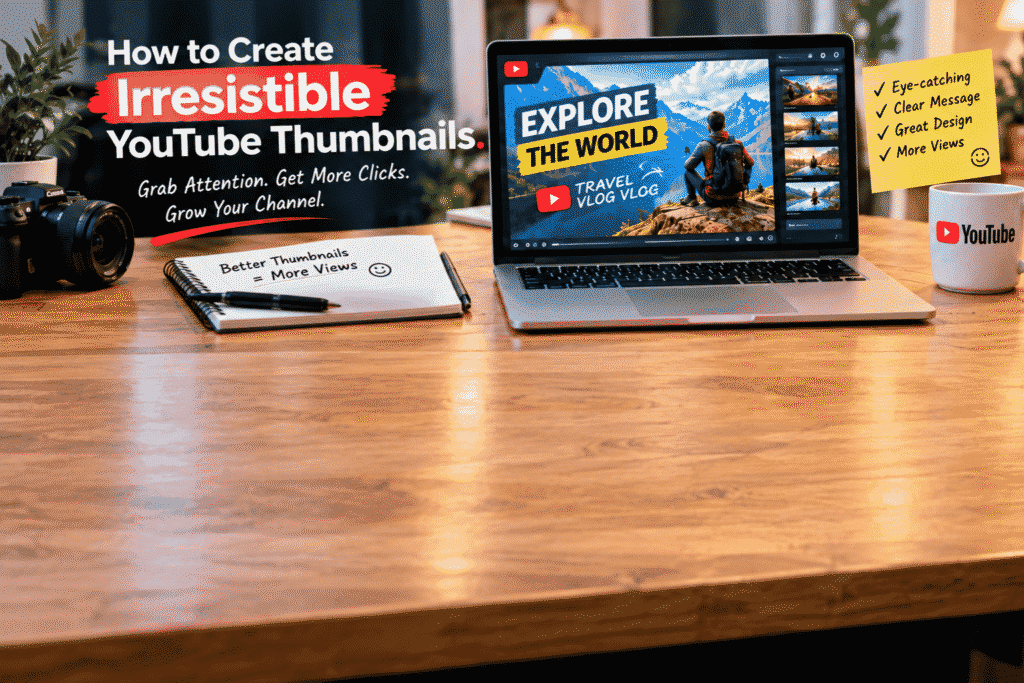
How to Create Irresistible YouTube Thumbnails
You can spend hours creating a great YouTube video, writing a useful script, recording it, and editing every little detail. But before someone watches any of that work, they usually see one thing first:
Your thumbnail.
A thumbnail is often the first visual impression of your video. If it doesn’t immediately communicate what the video is about or give viewers a reason to click, your great content may never get the attention it deserves.
The good news is that creating an effective YouTube thumbnail doesn’t require you to be a professional graphic designer. With the right approach, a few simple design principles can make a huge difference.
Why YouTube Thumbnails Matter
Think of your thumbnail as a tiny billboard for your video.
When someone is scrolling through YouTube, they’re surrounded by competing videos. Your thumbnail needs to communicate an idea quickly, even when it’s displayed at a small size.
A good thumbnail can help:
- Grab attention
- Communicate the video’s topic
- Create curiosity
- Make your channel look professional
- Strengthen your visual brand
- Encourage viewers to consider clicking
Of course, a thumbnail can’t make a weak video valuable. The best results come when the thumbnail accurately represents useful content.
1. Start With One Clear Idea
One of the most common thumbnail mistakes is trying to say too much.
You may want to include the video title, a subtitle, several images, icons, logos, arrows, charts, and other elements. The result can become difficult to understand.
Instead, ask yourself:
“What is the one thing I want viewers to notice first?”
Build the thumbnail around that idea.
If your video is about saving money while traveling, for example, a simple headline such as:
TRAVEL ON A BUDGET
may communicate the idea much faster than a paragraph of text.
2. Keep Your Text Short and Bold
Remember that people may see your thumbnail on a phone.
Tiny text is difficult to read, especially when viewers are quickly scrolling.
Try using short phrases with large, bold lettering.
Examples include:
- GET MORE VIEWS
- START A BUSINESS
- AI MADE THIS?
- EDIT LIKE A PRO
- SAVE MORE MONEY
- 5 EASY TIPS
You don’t need to repeat your entire video title on the thumbnail.
Instead, use the thumbnail text to complement the title and create a clear visual message.
3. Choose Colors That Stand Out
Color is one of the easiest ways to make a thumbnail noticeable.
Strong contrast between the background, text, and main subject can help important elements stand out.
For example, you might use:
- Bright text on a dark background
- Dark text inside a light text box
- A colorful subject against a simple background
- A bold accent color to highlight one word
You don’t need ten different colors.
In many cases, using two or three strong colors consistently creates a cleaner and more professional result.
4. Use High-Quality Images
A blurry or poorly cropped image can make even a great thumbnail look unprofessional.
Whenever possible, use sharp, high-quality visuals.
Depending on your content, you could use:
- Your own photographs
- Product images
- Screenshots
- Illustrations
- Graphics
- AI-generated visuals
- Carefully selected stock images
The image should support the video’s idea rather than simply fill empty space.
5. Faces and Expressions Can Add Emotion
Human faces naturally attract attention, which is why many successful thumbnails use expressive portraits.
A surprised, excited, curious, or happy expression can communicate emotion instantly.
But you don’t need a face in every thumbnail.
If your video is about technology, travel, food, design, or another visual topic, the main object or scene may be more important than a person.
The goal is to create an immediate visual connection.
6. Create Strong Visual Hierarchy
Not every element in your thumbnail should have equal importance.
A viewer should naturally notice the most important element first, then the supporting elements.
A simple hierarchy might look like this:
Main subject → headline → supporting visual → small branding element
If everything is large, colorful, and bold, nothing feels important.
Give your main element room to breathe.
7. Use Contrast to Create Focus
Contrast isn’t only about colors.
You can also create contrast through:
- Size
- Shape
- Brightness
- Position
- Texture
- Typography
For example, placing a large subject against a simple background can immediately draw attention to it.
Similarly, using one bright word inside an otherwise simple headline can create a visual focal point.
8. Don’t Overload the Design
More elements don’t automatically mean a better thumbnail.
In fact, adding too much information can make your design confusing.
Avoid filling every available space.
Instead, remove anything that doesn’t contribute to the main message.
A clean thumbnail with three strong elements will often communicate more effectively than a crowded design containing ten different elements.
9. Create Curiosity Without Misleading People
An effective thumbnail should make people interested in the video.
But there’s an important difference between creating curiosity and misleading viewers.
Your thumbnail should accurately represent what viewers will find in the video.
For example, if your video teaches five AI tools, highlighting one surprising result can create curiosity.
But showing something completely unrelated just to get clicks can damage viewer trust.
Think long-term.
A viewer who clicks because they genuinely want the information is much more valuable than someone who clicks and immediately feels disappointed.
10. Keep Your Branding Consistent
If you’re building a YouTube channel, your thumbnails can become part of your visual identity.
You might consistently use:
- The same font family
- A recognizable color palette
- Similar layouts
- A particular image style
- A small logo or brand element
You don’t need every thumbnail to look identical.
Instead, create a recognizable visual language that helps viewers identify your content.
Test Different Ideas
You don’t always know which thumbnail will perform best before publishing.
That’s why experimentation matters.
Try different versions with variations in:
- Headline
- Image
- Color
- Composition
- Facial expression
- Background
- Visual emphasis
If your YouTube analytics and available testing features provide useful performance data, use that information to learn what resonates with your audience.
Over time, you’ll develop a much better understanding of the visual styles that work for your particular channel.
A Simple Thumbnail Formula
If you’re not sure where to start, try this basic structure:
One strong image + short headline + high contrast + simple background + one visual accent
For example, imagine you’re creating a video titled:
“How to Start a YouTube Channel in 2026.”
Your thumbnail could feature:
- A clear image of a creator setup
- Large text: START YOUTUBE
- A contrasting background
- One highlighted visual element
- Minimal additional information
Simple doesn’t mean boring.
It means the viewer understands the message quickly.
Tools You Can Use
You don’t need expensive software to create good thumbnails.
Depending on your workflow, you can use tools such as:
- Canva
- Adobe Photoshop
- Adobe Express
- Figma
- AI image-generation tools
- Other online graphic design platforms
The software matters less than your understanding of composition, typography, contrast, and visual communication.
Final Thoughts
A great YouTube thumbnail isn’t simply a pretty picture.
It’s a visual promise.
It tells viewers what your video is about, creates interest, and gives them a reason to stop scrolling.
The best thumbnails are usually focused, readable, visually strong, and honest about the content behind them.
Start with one clear idea.
Use fewer words.
Choose strong visuals.
Create contrast.
Make your main subject obvious.
And most importantly, keep experimenting.
Great content deserves a thumbnail that gets people to notice it.
